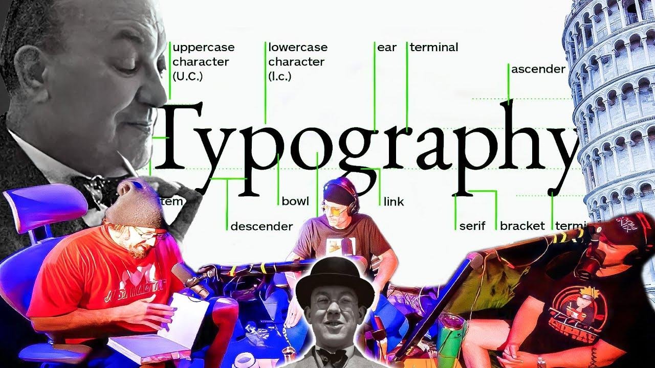
Sam Hyde, Nick Rochefort, and Charls Carroll’s Take on Jan Tschichold’s Unique Typography and Their Top Font Picks!
Ride the wave of typographic rebellion: From the austere shackles of sans-serif’s geometric prison to the liberating serifs that dance like a jester’s bells, typography is more than letters—it’s the soul’s undulating expression. 🖋️😵🤘 #FontsAreFashionsOfThought
📖 Jan Tschichold’s Influence on Modern Typography and the Autistic Approach
Discussions around typography can often turn intricate, especially when they involve historical influences and personal insights. Sam Hyde, Nick Rochefort, and Charls Carroll delve into the world of typography, bringing into focus Jan Tschichold’s contributions and his views, particularly on Sans serif typefaces. They scrutinize Tschichold’s early life, his shift from German script to Russian-inspired modernist typography, and his later rejection of his principles toward serif typefaces, which he once dismissed as ornate and ostentatious.
📚 Shifting Views on Typography and Ornamentation
Sam Hyde talks about how Tschichold’s personal philosophies and the economic circumstances of his family influenced his lifelong quest to streamline type and abolish ornamentation. Despite his efforts to advocate for Sans serif fonts, he later seemingly admits defeat, acknowledging the readability of serif typefaces. Nevertheless, Tschichold’s philosophical stance on typography left an indelible mark on the industry.
🤔 The Historical Context and Tschichold’s Transformation
Tschichold’s transformation over the years shows parallels to the transition in the industry itself—from opulent serifs to stark Sans serifs and back. The podcast hosts touch on Tschichold’s fascination with Russian Constructivists, his manifesto on the ‘New Typography,’ and the way his story intertwines with the overarching trends of 20th-century design and aesthetics.
🖋️ Sans Serif and Serif Typeface: A Battle Over Readability
The discussion takes a technical turn as they examine the practical aspects of typography: readability, decoration, and utilitarian design principles. The conversation underscores that for all the aesthetic ideology that surrounds typefaces, the primary goal remains—whether a font facilitates effective communication.
🧐 Understanding the Practicality of Serif vs. Sans Serif
The hosts talk about the readabilities of different typefaces, connecting this to historical conceptions of what makes typography ‘antihuman’ versus conducive to a clear presentation of ideas. An interesting angle is introduced with the idea of wingdings and other symbolic fonts, and how this ties into the overall usability of type in various contexts.
💡 The Contrast Between Serif and Sans Serif in Real-World Use
Through vivid examples, they pinpoint that utility and application should drive font choices more than personal preferences or historical attachments. Furthermore, the hosts convey that while certain fonts can channel a specific aesthetic, e.g., a sci-fi vibe or elegance, it’s ultimately about the effectiveness of the type in its intended setting.
🎨 Personal Preferences and the Subjectivity of Typographic Beauty
The personal tastes in fonts of the podcast hosts come to light as they candidly share favorites and less favored options. The conversation also touches on how personal experiences and needs, like dyslexia, can influence typographical choices.
🖼️ Aesthetic Sensibilities and Influences in Font Choices
Subjectivity in the appreciation of fonts is evident in their discussion of various typefaces. Personal biases, from the practicality of utility-focused fonts to the beauty of design-centric choices, reflect the diverse spectrum of typography appreciation.
🌟 Font Aesthetics and Individual Experiences Molding Typography Perspectives
Exploring fonts like Eurostile and Futura, they disclose how certain designs resonate more profoundly based on individual biases and the context of usage. This passage of the discussion personalizes the broader conversation about typography and shows its multifaceted nature.
📝 The Enduring Legacy of Jan Tschichold and Typographic Evolution
In the end, the hosts acknowledge Tschichold’s complex legacy as a prime mover in the world of typography. His story illustrates the evolution of typographic design and the ongoing debates about functionality versus aesthetics.
🔄 Typographic Evolution: Learning from Jan Tschichold’s Life Journey
Reflecting on Jan Tschichold’s journey from a devout sans-serif advocate to a more inclusive view exemplifies the fluid nature of design philosophies. It also prompts a broader reflection on how personal experiences can sway professional discourse in the field of typography.
🛠️ The Impact of Typographic Choices on Human Experience and Communication
The hosts surmise that despite personal philosophies, the true measure of typography’s success lies in its ability to aid readability and enhance communication. Whether through the simplicity of sans-serif or the traditional clarity of serif, the ultimate goal of typography remains constant.
Conclusion: Embracing a Diverse Approach to Typography
In summary, the podcast conversation with Sam Hyde and his co-hosts explores the complex relationship between typography, personal preference, readability, and design history. They examine Jan Tschichold’s conflicted legacy and discuss the merits of various fonts and styles, emphasizing the importance of contextual suitability and personal experiences in the broader narrative of typographic design.
Key Takeaways from the Podcast Analysis of Typography
| Takeaways |
|---|
| Jan Tschichold’s dynamic influence on typography |
| The readability debate between serif and sans serif |
| Personal experiences shaping font preferences |
| Typography’s balance between functionality and aesthetics |
| Evolution of typographic beliefs and practices |
FAQ :
What is the serif vs. sans serif debate about?
The debate centers on whether serif or sans serif typefaces are more readable and aesthetically pleasing.Who was Jan Tschichold?
Jan Tschichold was a typographer who initially endorsed modern sans serif fonts but later recognized the readability and utility of serif typefaces.What is the importance of readability in typography?
Readability ensures that typefaces serve their primary function: to communicate text effectively to a reader.Can personal experiences influence typographic preferences?
Yes, as evidenced by the podcast speakers, personal experiences and needs can highly influence font choices.How does typography reflect cultural and historical changes?
Typographic preferences often mirror broader cultural and historical trends, like the early 20th-century modernist movement.


